
How to Choose Artwork for Your Space
An approachable guide to artwork size, placement, materials, framing, and light.
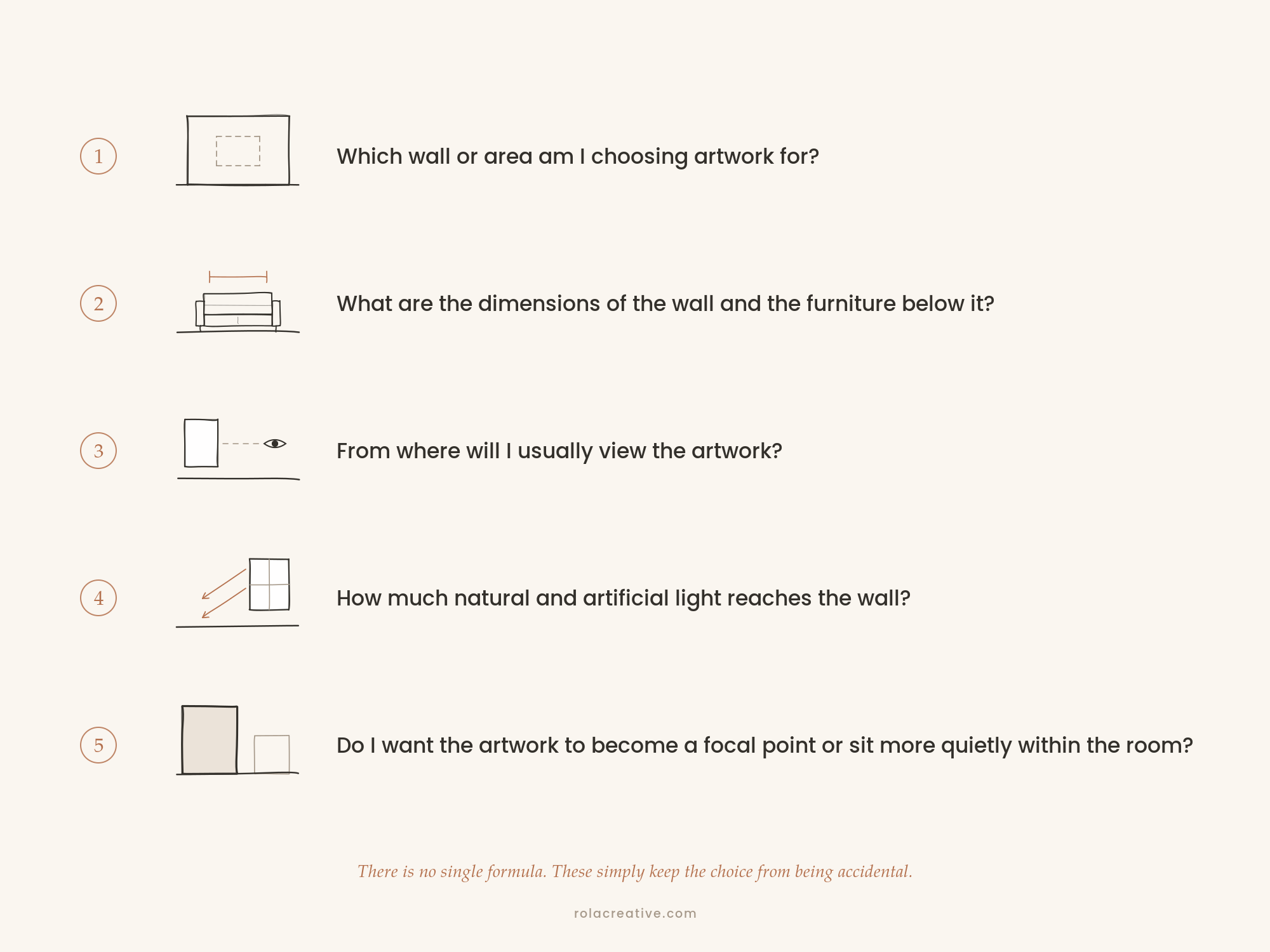
Before You Choose Your Artwork
Choosing artwork begins with a personal connection, but bringing it into your home requires a few practical decisions.
What size should you choose? How high should it hang? Should it be printed on fine-art paper, canvas, or metal? And how do you make sure it feels intentional in the room rather than too small, too high, or disconnected from everything around it?
There is no single formula for creating a beautiful space, and decorating rules should never override the work you love. Still, a few reliable guidelines can help you avoid the most common mistakes and make your decisions with greater confidence.
This guide covers the practical side of choosing artwork: measuring your space, selecting the right size, planning the placement, and choosing a material that supports both the image and the room.
For the more personal side of the process—how to recognize the work that feels meaningful and belongs in your home—I will explore that separately in How to Know What Art Belongs in Your Home.
How to Choose the Right Artwork Size
The most common mistake people make is choosing artwork that is too small. Begin by measuring the wall itself, along with any furniture that will sit beneath the artwork. Take note of:
The width of the wall
The width of the sofa, bed, console, or other furniture below it
The space between the furniture and the ceiling
Nearby windows, doors, shelves, and architectural details
The distance from which you will usually view the artwork
When comparing sizes, always use the finished dimensions of the piece whenever possible. A 24-by-36-inch paper print will become larger once it is matted and framed. Canvas and metal presentations may remain closer to the listed dimensions, depending on whether an additional frame is used.
It also helps to take a photograph of the wall straight on. You can use it later to compare sizes or create a simple digital mockup.
A piece can be beautiful on its own and still feel lost above a long sofa or in the middle of a large wall. In many rooms, choosing a larger size creates a more grounded and intentional result.
As a starting point, artwork placed above a sofa, bed, console, or sideboard can occupy approximately two-thirds to three-quarters of the furniture’s width.
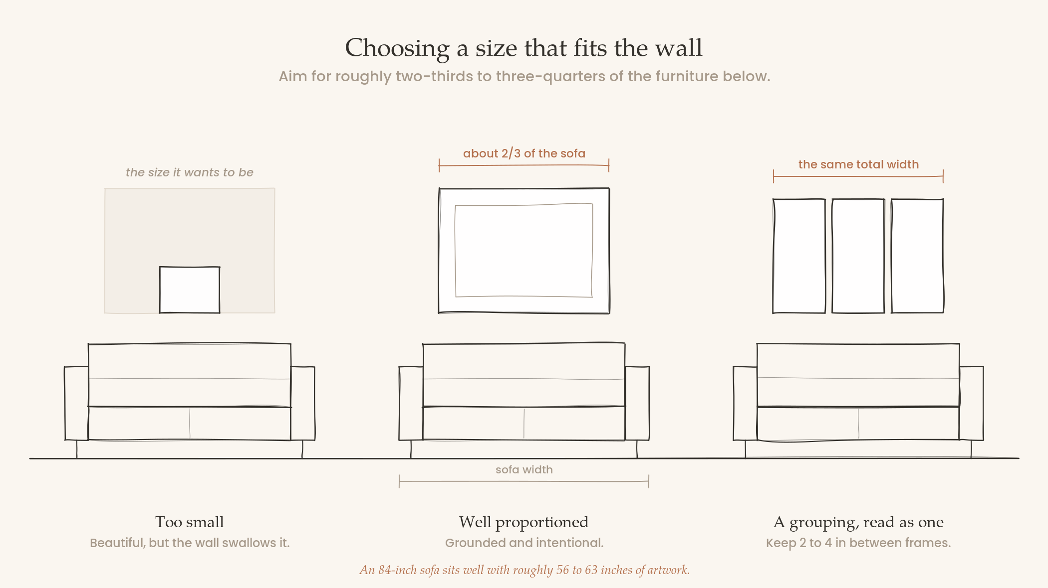
For example:
An 84-inch sofa may work well with artwork approximately 56 to 63 inches wide.
A 72-inch console may work well with artwork approximately 48 to 54 inches wide.
A 60-inch bed may work well with artwork approximately 40 to 45 inches wide.
These measurements include the complete arrangement, whether you choose one large work, a pair, or several smaller pieces. They are also guidelines, not fixed rules. A large vertical piece can work beautifully over a wide console. A collection of smaller works can occupy the same visual area as one horizontal photograph. What matters is how the complete arrangement relates to the furniture, wall, and surrounding space.
If you are hanging several pieces together, approximately 2 to 4 inches between frames is often a useful starting point. Keeping the spacing consistent helps the works read as one composition.
Art also needs some room around it. Avoid placing a frame so close to a window, doorway, shelf, or decorative object that everything begins to compete.
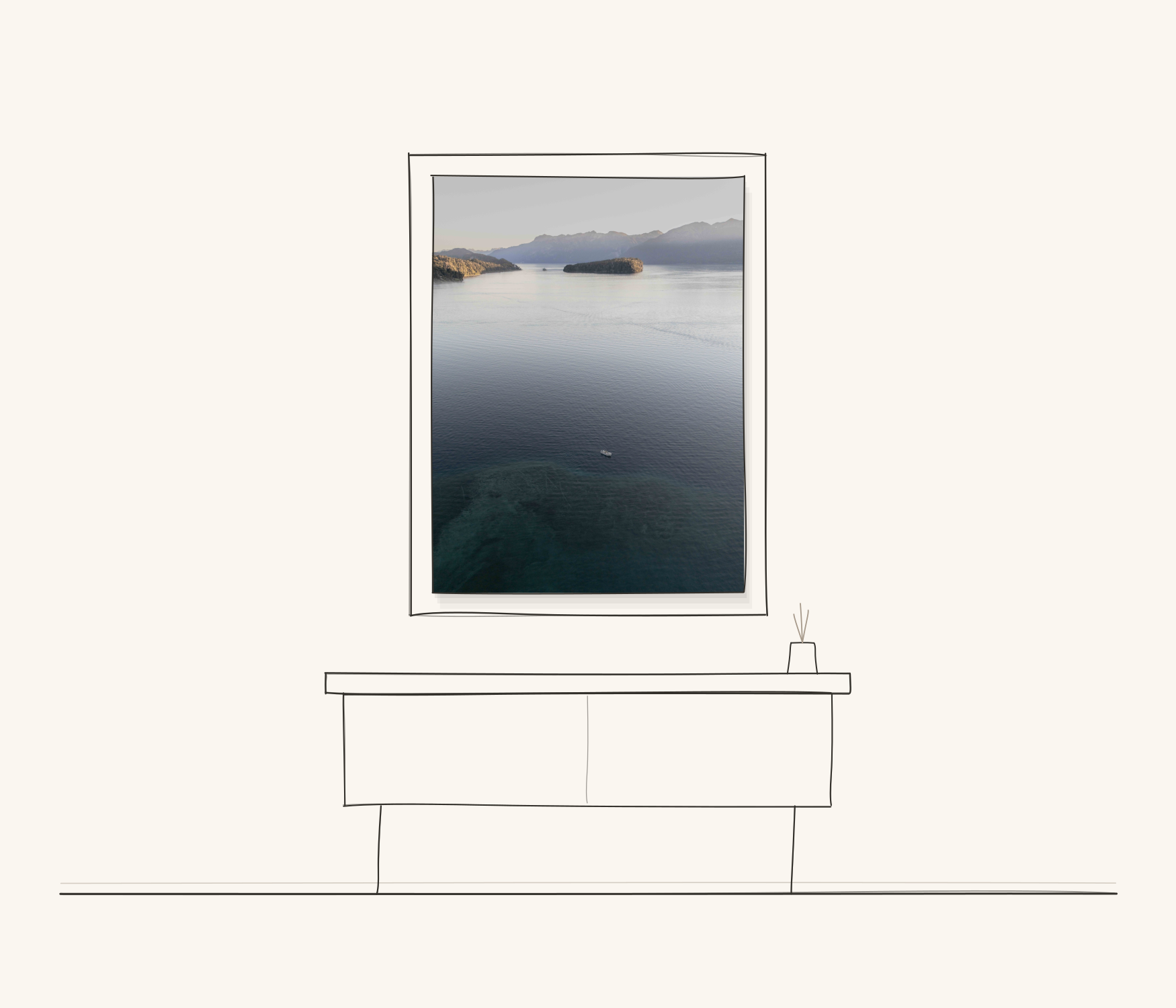
A photograph such as Passage from my Southern Light series becomes especially immersive at a larger scale. From across the room, the composition appears almost abstract. As you approach it, the boat and movement of the water begin to reveal themselves.
Scale affects not only how the artwork fits the wall, but also how the image is experienced.
How High to Hang Artwork
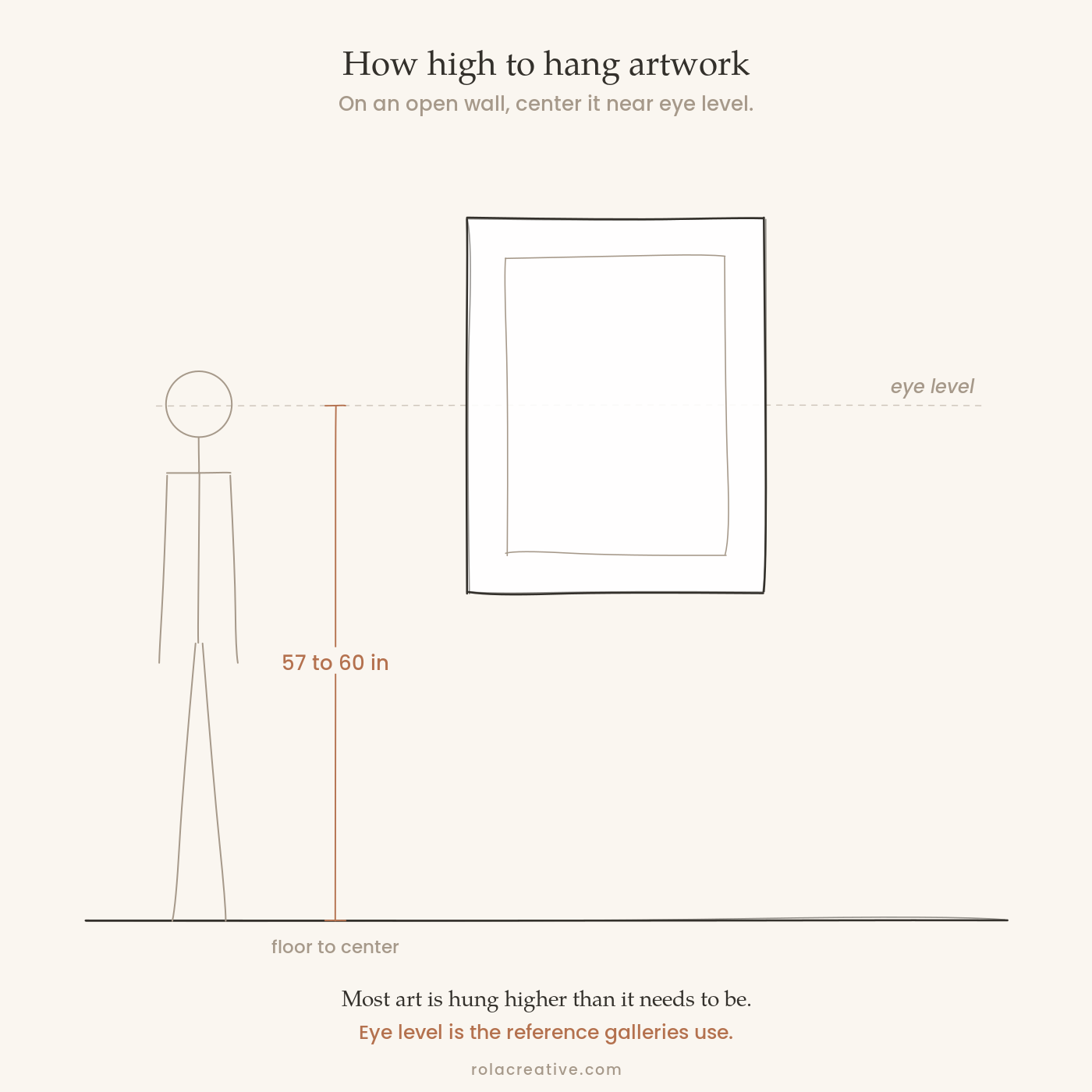
Artwork is often hung higher than it needs to be.
On an open wall, position the center of the artwork approximately 57 to 60 inches from the floor. This places it near average eye level and is a useful reference commonly used in galleries.
Above furniture, the relationship between the artwork and the furniture becomes more important than its distance from the floor. Leave approximately 6 to 10 inches between the top of the furniture and the bottom of the frame. Too much distance can make the piece appear to float separately above the room. Too little can make the arrangement feel crowded.
These measurements may shift for very large work, tall furniture, unusual ceilings, or rooms where the artwork will mostly be viewed while seated. The goal is not to follow the number perfectly, but to create a balanced relationship between the art, furniture, and architecture.
How to Choose an Artwork Material
The material affects the artwork’s texture, reflection, detail, and overall presence in the room.
For photographic work, the main options are fine-art paper, canvas, acrylic and metal. The right choice depends on the image, the light in the space, and how you want the finished piece to feel.
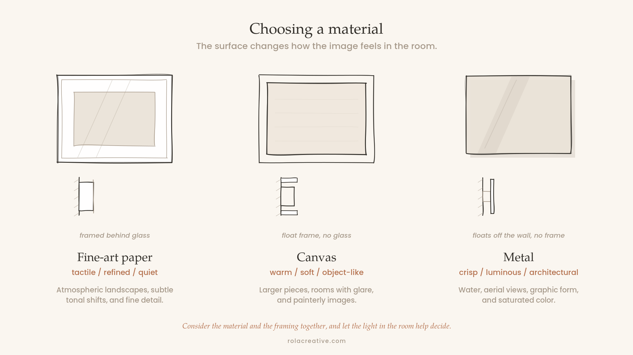
Fine-Art Paper
Fine-art paper offers a tactile, refined presentation and is especially well suited to atmospheric landscapes, subtle tonal changes, and detailed images.
Matte or lightly textured paper can give a photograph a softer, more physical quality. Paper prints are normally framed behind glazing and may be displayed with a mat, floated to reveal the paper’s edge, or framed more closely for a contemporary look.
Choose fine-art paper when you want the artwork to feel quiet, collected, and traditionally framed.
Canvas
Canvas creates a softer, more object-like presentation and does not require glass.
It works well for larger pieces, rooms with potential glare, and images with an atmospheric or painterly quality. The visible canvas texture may soften very fine details slightly, which can complement some photographs more than others.
Canvas can be displayed on its own or in a float frame, which leaves a narrow gap around the work and gives it a finished architectural edge.
Choose canvas when you want the artwork to feel warm, substantial, and integrated into the room.
Metal
Metal offers a clean, contemporary presentation with crisp detail and visual depth.
It works particularly well for photographs involving water, aerial views, graphic forms, contrast, or saturated color. Surface Memory and Passage, for example, can benefit from the clarity and luminosity of this surface.
Metal is often displayed without a traditional frame. Glossy finishes create more intensity and reflection, while matte finishes feel quieter and reduce glare.
Choose metal when you want the artwork to feel crisp, minimal, and architectural.
How Lighting Affects Artwork
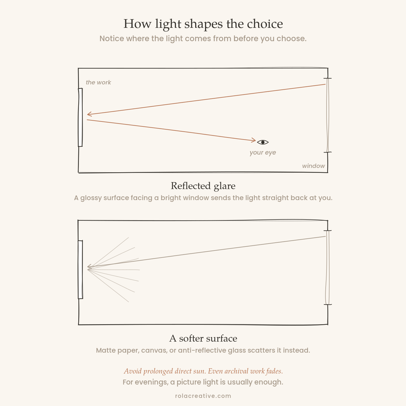
Before choosing a material, notice how light moves through the room.
Does the wall receive direct sunlight? Is there a large window opposite it? Are there bright ceiling fixtures nearby?
Reflective glazing or glossy metal can be distracting when positioned across from a bright window. In rooms with significant natural light, consider matte paper, anti-reflective glazing, canvas, or matte metal.
Avoid prolonged direct sunlight whenever possible. Even high-quality archival materials can be affected by significant ultraviolet exposure over time.
Artificial light matters too. A picture light, directional ceiling fixture, or nearby lamp can bring out detail in the evening. Soft, even illumination is often enough.
How to Test Artwork Size Before Buying
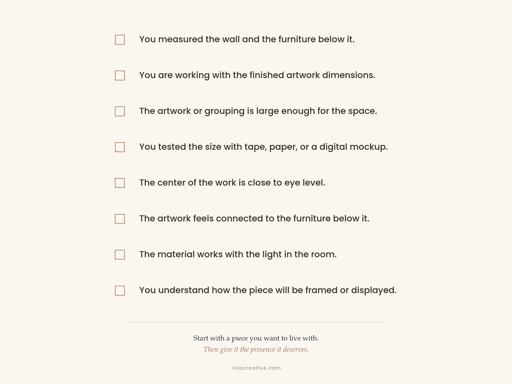
Final Checklist
Measurements can feel very different once you see them on the wall.
Before ordering or hanging a piece, test the finished dimensions in the room. You can:
Outline the size with painter’s tape
Cut kraft paper or cardboard to the finished dimensions
Mark the corners with removable tape
Photograph the wall and create a digital mockup
Remember to include the mat and frame in your test when applicable.
Leave the outline on the wall for a day or two. Look at it from the entrance, from where you normally sit, and from nearby rooms.
A size that appears substantial when written down can feel surprisingly modest once it is surrounded by furniture and architecture.
Digital mockups are especially helpful when comparing two sizes or deciding between one large work and a grouping. I often use them to help collectors understand how one of my photographs might live in their space.
If you'd like all of this information in one place, I made a free guide, Artwork for Your Space, with the measurements, material comparisons, and measuring templates you can print and use at home. You can get it here.
Train and Trust Your Eye
These guidelines can help you avoid the most common mistakes, but they are not meant to remove personality from the process.
Start with a piece you want to live with. Then use scale, placement, materials, and framing to give it the presence it deserves.
For more on the personal side of choosing artwork—the feeling, memory, and point of view a piece can bring into a home—read How to Know What Art Belongs in Your Home.
If you are considering one of my works and are unsure about size or placement, you are welcome to send me a photograph and the approximate dimensions of your wall. I am happy to help you visualize how the work might live in your space.
With love,
Val